NAME
IUP::List - [GUI element] displays a list of items (listbox, combobox, dropdown)
DESCRIPTION
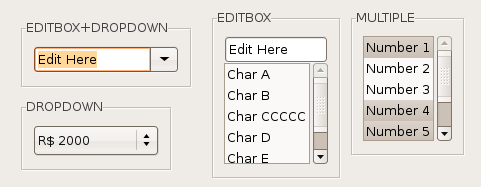
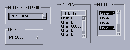
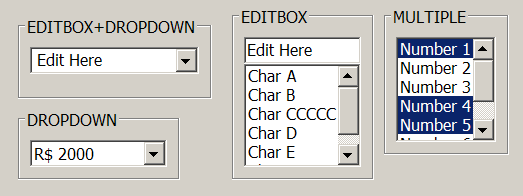
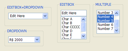
Creates an interface element that displays a list of items. The list can be visible or can be dropped down. It also can have an edit box for text input. So it is a 4 in 1 element. In native systems the dropped down case is called Combo Box.
| GTK | Motif |
|---|---|
 |
 |
| Windows Classic | Windows XP Style |
|---|---|
 |
 |
USAGE
CREATION - new() method
$list = IUP::List->new( 1=>"Firts item", 2=>"Second item" );Returns: the identifier of the created element, or undef if an error occurs.
NOTE: You can pass to new() other ATTRIBUTE=>'value' or CALLBACKNAME=>\&func pairs relevant to this element - see IUP::Manual::02_Elements.
ATTRIBUTES
For more info about concept of attributes (setting/getting values etc.) see IUP::Manual::03_Attributes. Attributes specific to this element:
- "1"
-
First item in the list.
- "2"
-
Second item in the list.
- "3"
-
Third item in the list.
- "<n>"
-
n-th item in the list.
The values can be any text. Items before "1" are ignored. Before map the first item with a
undefis considered the end of the list and items can be set in any order. After map, there are a few rules:- if "1" is set to
undef, all items are removed. - if "n" is set to
undef, all items after n are removed. - if "n" is between the first and the last item, the current nth item is replaced. The effect is the same as removing the old item and inserting a new one at the old position.
- if "n+1" is set then it is appended after the last item.
- Items after "n+1" are ignored.
- if "1" is set to
- APPENDITEM
-
(write-only)
Inserts an item after the last item. Ignored if set before map.
- AUTOHIDE
-
Scrollbars are shown only if they are necessary. Default: "YES".
- AUTOREDRAW
-
[Windows] (non inheritable)
Automatically redraws the list when something has change. Set to NO to add many items to the list without updating the display. Default: "YES". (since iup-3.3)
- BGCOLOR
-
Background color of the text.
Default: the global attribute TXTBGCOLOR. In GTK does nothing when DROPDOWN=Yes.
- CANFOCUS
-
(creation only) (non inheritable)
Enables the focus traversal of the control. In Windows the control will still get the focus when clicked. Default: YES.
- COUNT
-
(read-only) (non inheritable)
Returns the number of items. Before mapping it counts the number of non
undefitems before the firstundefitem. - DRAGDROP
-
[Windows and GTK Only] (non inheritable)
Enable or disable the drag&drop of files. Default: NO, but if DROPFILES_CB is defined when the element is mapped then it will be automatically enabled.
- DROPDOWN
-
(creation only)
Changes the appearance of the list for the user: only the selected item is shown beside a button with the image of an arrow pointing down. To select another option, the user must press this button, which displays all items in the list. Can be "YES" or "NO". Default "NO".
- DROPEXPAND
-
[Windows Only]
When DROPDOWN=Yes the size of the dropped list will expand to include the largest text. Can be "YES" or "NO". Default: "YES".
- EDITBOX
-
(creation only)
Adds an edit box to the list. Can be "YES" or "NO". Default "NO".
- FGCOLOR
-
Text color. Default: the global attribute TXTFGCOLOR.
- INSERTITEMn
-
(write-only)
Inserts an item before the given n position. n starts at 1. If n=COUNT+1 then it will append after the last item. Ignored if out of bounds. Ignored if set before map. (since 3.0)
- MULTIPLE
-
(creation only)
Allows selecting several items simultaneously (multiple list). Default: "NO". Only valid when EDITBOX=NO and DROPDOWN=NO.
- REMOVEITEM
-
(write-only)
Removes the given value. value starts at 1. If value is
undefremoves all the items. Ignored if set before map. - SCROLLBAR
-
(creation only)
Associates automatic scrollbars to the list when DROPDOWN=NO. Can be: "YES" or "NO" (none). Default: "YES". For all systems, when SCROLLBAR=YES the natural size will always include its size even if the native system hides the scrollbars. If AUTOHIDE=YES scrollbars are shown only if they are necessary, by default AUTOHIDE=YES. In Motif, SCROLLBAR=NO is not supported and if EDITBOX=YES the horizontal scrollbar is never shown.
When DROPDOWN=YES the scrollbars are system dependent, and do NOT depend on the SCROLLBAR or AUTOHIDE attributes. Usually the scrollbars are shown if necessary. In GTK, scrollbars are never shown and all items are always visible. In Motif, the horizontal scrollbar is never shown. In Windows, if DROPEXPAND=YES then the horizontal scrollbar is never shown.
- SHOWDROPDOWN
-
(write-only)
Opens or closes the dropdown list. Can be "YES" or "NO". Valid only when DROPDOWN=YES. Ignored if set before map.
- SIZE
-
Size of the list. The Natural =item Size is defined by the number of elements in the list and the with of the largest item, the default has room for 5 characters in 1 item. In IUP 3, the Natural Size ignores the list contents if VISIBLECOLUMNS or VISIBLELINES attributes are defined. The text in the edit box is ignored when considering the list contents.
- SORT
-
(creation only)
Force the list to be alphabetically sorted. When using INSERTITEMn or APPENDITEM the position will be ignored.
- TOPITEM
-
(write-only)
Position the given item at the top of the list or near to make it visible. Valid only when DROPDOWN=NO.
- SPACING
-
Internal padding for each item. Notice that vertically the distance between each item will be actually 2x the spacing. It also affects the horizontal margin of the item. In Windows, the text is aligned at the top left of the item always. Valid only when DROPDOWN=NO.
- VALUE
-
(non inheritable)
Depends on the DROPDOWN+EDITBOX combination:
- EDITBOX=YES: Text entered by the user.
- DROPDOWN=YES or MULTIPLE=NO: Integer number representing the selected item in the list (begins at 1). It can be zero if there is no selected item. The value can be
undeffor no item selected (In Motif when DROPDOWN=YES there is always an item selected, except only when the list is empty). - MULTIPLE=YES: Sequence of '+' and '-' symbols indicating the state of each item. When setting this value, the user must provide the same amount of '+' and '-' symbols as the amount of items in the list, otherwise the specified items will be deselected.
- VISIBLE_ITEMS
-
[Windows and Motif Only]
Number of items that are visible when DROPDOWN=YES is used for the dropdown list. Default: 5.
- VISIBLECOLUMNS
-
Defines the number of visible columns for the =item Natural Size, this means that will act also as minimum number of visible columns. It uses a wider character size then the one used for the SIZE attribute so strings will fit better without the need of extra columns.
VISIBLELINES
When DROPDOWN=NO defines the number of visible lines for the Natural Size, this means that will act also as minimum number of visible lines.
The following IUP::Text attributes, but are also valid for IUP::List but only when EDITBOX=YES and effective only for the edit box inside the list.
- APPEND, CARET, CARETPOS, CLIPBOARD, CUEBANNER, FILTER, INSERT, PADDING, MASK, NC, READONLY, SELECTEDTEXT, SELECTION, SELECTIONPOS, SCROLLTO, SCROLLTOPOS
The following common attributes are also accepted:
ACTIVE, FONT, EXPAND, SCREENPOSITION, POSITION, MINSIZE, MAXSIZE, WID, TIP, RASTERSIZE, ZORDER, VISIBLE
CALLBACKS
For more info about concept of callbacks (setting callback handlers etc.) see IUP::Manual::04_Callbacks. Callbacks specific to this element:
- ACTION
-
Action generated when the state of an item in the list is changed. Also provides information on the changed item:
Callback handler prototype:
sub action_handler {
  my ($self, $text, $item, $state) = @_;
  #...
}
$self: reference to the element (IUP::List) that activated the event
$text: Text of the changed item.
$item: Number of the changed item starting at 1.
$state: Equal to 1 if the option was selected or to 0 if the option was deselected.
The state=0 is simulated internally by IUP in all systems. If you add or remove items to/from the list and you count on the state=0 value, then after adding/removing items set the VALUE attribute to ensure proper state=0 value.
- BUTTON_CB
-
Action generated when any mouse button is pressed or released inside the list. Called only when DROPDOWN=NO. If the list has an editbox the message is called when cursor is at the listbox only (ignored at the editbox). Use ConvertXYToPos to convert (x,y) coordinates in item position.
- CARET_CB
-
Action generated when the caret/cursor position is changed. Valid only when EDITBOX=YES.
Callback handler prototype:
sub caret_cb_handler {
  my ($self, $lin, $col, $pos) = @_;
  #...
}
$self: reference to the element (IUP::List) that activated the event
$lin, $col: line and column number (start at 1).
$pos: 0 based character position.
For lists lin is always 1, and pos is always "col-1".
This is the same CARET_CB callback definition as for the IUP::Text.
- DBLCLICK_CB
-
Action generated when the user double click an item. Called only when DROPDOWN=NO.
Callback handler prototype:
sub dblclick_cb_handler {
  my ($self, $item, $text) = @_;
  #...
}
$self: reference to the element (IUP::List) that activated the event
$item: Number of the selected item starting at 1.
$text: Text of the selected item.
- DROPDOWN_CB
-
Action generated when the list of a dropdown is shown or hidden. Called only when DROPDOWN=YES.
Callback handler prototype:
sub dropdown_cb_handler {
  my ($self, $state) = @_;
  #...
}
$self: reference to the element (IUP::List) that activated the event
$state: state of the list 1=shown, 0=hidden.
- DROPFILES_CB
-
[Windows and GTK Only]
Action generated when one or more files are dropped in the element.
- EDIT_CB
-
Action generated when the text in the text box is manually changed by the user, but before its value is actually updated. Valid only when EDITBOX=YES.
Callback handler prototype:
sub edit_cb_handler {
  my ($self, $c, $new_value) = @_;
  #...
}
$self: reference to the element (IUP::List) that activated the event
$c: valid alpha numeric character or 0.
$new_value: Represents the new text value.
Returns: IUP_CLOSE will be processed, but the change will be ignored. If IUP_IGNORE, the system will ignore the new value. If c is valid and returns a valid alpha numeric character, this new character will be used instead. The VALUE attribute can be changed only if IUP_IGNORE is returned.
This is the same ACTION callback definition as for the IUP::Text.
- MOTION_CB
-
Action generated when the mouse is moved over the list. Called only when DROPDOWN=NO. If the list has an editbox the message is called when cursor is at the listbox only (ignored at the editbox). Use ConvertXYToPos to convert (x,y) coordinates in item position.
- MULTISELECT_CB
-
Action generated when the state of an item in the multiple selection list is changed. But it is called only when the interaction is over.
Callback handler prototype:
sub multiselect_cb_handler {
  my ($self, $value) = @_;
  #...
}
$self: reference to the element (IUP::List) that activated the event
$value: Similar to the VALUE attribute for a multiple selection list. Items selected are marked with '+', items deselected are marked with '-', and non changed items are marked with an 'x'.
This callback is called only when MULTIPLE=YES. If this callback is defined the ACTION callback will not be called.
The non changed items marked with 'x' are simulated internally by IUP in all systems. If you add or remove items to/from the list and you count on the 'x' values, then after adding/removing items set the VALUE attribute to ensure proper 'x' values.
- VALUECHANGED_CB
-
Called after the value was interactively changed by the user. Called when the selection is changed or when the text is edited.
Callback handler prototype:
sub valuechanged_cb_handler {
  my ($self) = @_;
  #...
}
$self: reference to the element (IUP::List) that activated the event
The following common callbacks are also accepted:
NOTES
Text is always left aligned.
The GETFOCUS_CB and KILLFOCUS_CB callbacks behave differently depending on the list configuration and on the native system:
If DROPDOWN=NO and EDITBOX=YES, then the list never gets the focus, the callbacks are called only when the edit box is clicked.
In Motif if DROPDOWN=YES then when the dropdown button is clicked the list looses its focus and when the dropped list is closed the list regain the focus, also when that happen if the list looses its focus to another control the kill focus callback is not called.
In GTK, if DROPDOWN=YES and EDITBOX=NO, both callbacks are called only when navigating with the keyboard (tip: if you need those callbacks with mouse navigation set EDITBOX=YES and READONLY=YES). Also in GTK, if DROPDOWN=YES and EDITBOX=YES then when the dropdown button is clicked the list looses its focus and it gets it back only if the edit box is clicked.
In Windows, if EDITBOX=YES then the tooltips are shown only when the cursor is near the control border or at the dropdown arrow. Also the selection and caret attributes are not preserved if the list loses its focus, or in other words these attributes are only useful in Windows if the list has the focus.
IMPORTANT: In Windows when DROPDOWN=Yes the vertical size is controlled by the system, and has the height just right to include the borders and the text. So the User height from RASTERSIZE or SIZE will be always ignored.
In GTK older than 2.12, the editbox of a dropdown will not follow the list attributes: FONT, BGCOLOR, FGCOLOR and SPACING.
Utility Functions
These functions can be used to set and get attributes from the element:
$elem->SetAttributeId($name, $id, $value);
$elem->GetAttributeId($name, $id);
They work just like the respective traditional set and get functions. But the attribute string is complemented with the id value. For ex:
$elem->SetAttributeId("", 3, $value) ~~ $elem->SetAttribute("3", $value)

$elem->SetAttributeId("INSERTITEM", 8, $value) ~~ $elem->SetAttribute("INSERTITEM8", $value)
But these functions are faster than the traditional functions because they do not need to parse the attribute name string and the application does not need to concatenate the attribute name with the id.
EXAMPLES
The element IUP::List is used in the following sample scripts:
0-basic/cbox.pl - IUP::Cbox example
0-basic/layoutdialog.pl - IUP::LayoutDialog example
0-basic/list1.pl - IUP::List example
0-basic/list2.pl - IUP::List example
0-basic/text_font.pl - IUP::Text (font) example
0-basic/zbox.pl - IUP::Zbox example
1-apps/app-mdi.pl - IUP app example
1-apps/app-sample1.pl - example used for screenshot - IUP.pod
1-apps/app-sample2.pl - example based on the original sample.c
SEE ALSO
ListDialog()">, IUP::Text
The original doc: iuplist.html