NAME
IUP::Expander - [GUI element] container that can interactively show or hide its child
DESCRIPTION
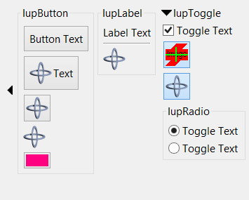
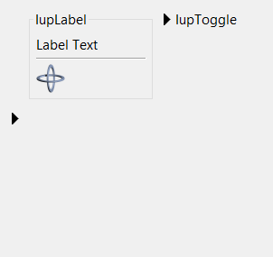
Creates a void container that can interactively show or hide its child.
It does not have a native representation, but it contains also a IUP::Canvas to implement the bar handler.
| Container Expanded (STATE = "OPEN") | Container Collapsed (STATE = "CLOSE") |
 |
 |
USAGE
CREATION - new() method
#standard way
$mlist = IUP::Expander->new( child=>$child, ANYATTRIBUTE=>'any value' );
#or with just 1 parameter
$mlist = IUP::Expander->new($child);
child: (named parameter) reference to an interface element.
Returns: the identifier of the created element, or undef if an error occurs.
NOTE: You can pass to new() other ATTRIBUTE=>'value' or CALLBACKNAME=>\&func pairs relevant to this element - see IUP::Manual::02_Elements.
ATTRIBUTES
For more info about concept of attributes (setting/getting values etc.) see IUP::Manual::03_Attributes. Attributes specific to this element:
- AUTOSHOW
-
(non inheritable) enables the automatic show of the child when mouse is over the handler more than 1 second. Default: No. See =item * Notes bellow.
- BARSIZE
-
(non inheritable) controls the size of the bar handler. Default: the height of a text line plus 5 pixels.
- BGCOLOR
-
ignored, transparent in all systems. Will use the background color of the native parent.
- FGCOLOR
-
Text color. Default: the global attribute DLGFGCOLOR.
- BARPOSITION
-
(creation only) Indicates the bar handler position. Possible values are "TOP", "BOTTOM", "LEFT" or "RIGHT". Default: "TOP".
- EXPAND
-
(non inheritable) The default value is "YES".
- STATE
-
(non inheritable) Show or hide the container elements. Possible values: "OPEN" (expanded) or "CLOSE" (collapsed). Default: OPEN. Setting this attribute will automatically change the layout of the entire dialog so the child can be recomposed.
- TITLE
-
(non inheritable) the title, shown in the title bar near the expand or collapse symbol. Shown only when BARPOSITION=TOP.
- WID
-
(read-only) returns -1 if mapped.
The following common attributes are also accepted:
ACTIVE, FONT, EXPAND, SCREENPOSITION, POSITION, MINSIZE, MAXSIZE, WID, TIP, SIZE, RASTERSIZE, ZORDER, VISIBLE
CALLBACKS
For more info about concept of callbacks (setting callback handlers etc.) see IUP::Manual::04_Callbacks. Callbacks specific to this element:
- ACTION
-
Action generated expander state is interactively changed. (Since iup-3.9)
Callback handler prototype:
sub action_handler {
  my ($self) = @_;
  #...
}
$self: reference to the element (IUP::Expander) that activated the event
NOTES
The IUP::Canvas bar handler is always the first child of the expander. It can be obtained using GetChild or GetNextChild.
The container can be created with no elements and be dynamic filled using Append or Insert.
When the TITLE is defined and BARPOSITION=TOP then the expand/collapse symbol is left aligned. In all other situations the expand/collapse symbol is centered.
When AUTOSHOW=Yes the dialog layout is NOT recalculated. The child is shown on top of the dialog, so the other children will not move or redraw. After the mouse is move away from the child then it is automatically hidden. IMPORTANT: this feature will ONLY work if the child is a native container like IUP::Frame, IUP::ScrollBar or IUP::Tabs.
EXAMPLES
The element IUP::Expander is used in the following sample scripts:
0-basic/expander.pl - IUP::Expander example
SEE ALSO
The original doc: iupexpander.html