NAME
Chart::Manual::Types - all chart types by example
OVERVIEW
This page illustrates all supported chart types, describes their special abilities and programming needs. More detailled information will be linked whenever available.
Currently available are xycharts with points, lines, mountains, bar charts, stacked bars, error bars, pie and ring charts with split and polar coordinate systems. Also composite charts are possible.
Generally, each chart type here is implementd by a class: Chart::* (name), which inherits most of its methods from Chart::Base. Every constructor takes two arguments, which are width and height of the later generated image.
Bars
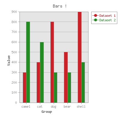
The class Chart::Bars creates a chart made up of a series of vertical bars. The length of each bar depicts one value of your second data set. The first data set however, defines the domain. In this example the first value of the first (domain) data set is 'camel'. So the first value of the second set (300) is positioned above the first tick on the x-axis labeled 'camel'. Right beside it is a differently colored bar, depticting the first value of the third data set (800). Since the option spaced_bars is set to 'true' on default, both bars are separated from the next group of bars. In this example it also makes also sense to activate the horizontal y_grid_lines and give them a subtle color. Further important was it to set the property min_val to zero, so that the bars could be seen in full length and not from the min value of the data sets (300) on upwards. precision set to zero just drops the decimals on the tick label so the chart looks a little cleaner. All the the other color set serv the same purpose.
use Chart::Bars;

my $g = Chart::Bars->new( 400, 400 );
$g->add_dataset( qw/ camel cat dog bear shell/ );
$g->add_dataset( 300, 400, 800, 500, 900 );
$g->add_dataset( 800, 600, 300, 300, 400 );

$g->set(
    title         => 'Bars !',
    x_label       => 'Group',
    y_label       => 'Value',
    y_grid_lines  => 'true',
    colors => {
        y_grid_lines => 'gray70',
        misc         => 'gray55',
        text         => 'gray55',
        x_label      => 'gray40',
        y_label      => 'gray40',
        title        => 'gray20',
    },
    min_val       =>  0,
    precision     =>  0,
    # spaced_bars   => 'false',
);
$g->png("bars.png");
Composite
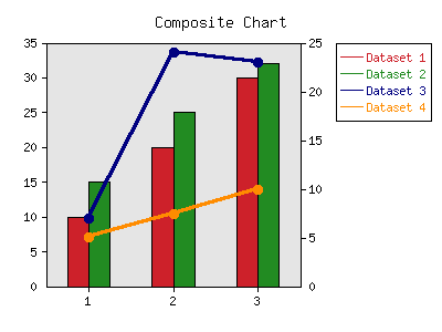
The class Chart::Composite creates a two component chart with two types of charts which are layered one above each other. Just set the option composite info. For example, you can create a two component chart with bars and lines. A composite chart does not make sense with all combinations of chart types, but it works pretty good with Lines, Points, LinesPoints and Bars. Note that two similar chart types may come into visual conflict. Chart::Composite can do only composite charts made up of two components.
In this example are the data sets one and two displayed as "Bars" and the next two als "LinesPoints" as set by the property composite_info. Please read these sections too. Otherwise we only colored the last data set for better contrast und cut the decimals from the axis labels via precision.
use Chart::Composite;

my $g = Chart::Composite->new( );
$g->add_dataset( 1,   2,   3 );
$g->add_dataset( 10,  20,  30 );
$g->add_dataset( 15,  25,  32 );
$g->add_dataset( 7,   24,  23 );
$g->add_dataset( 5.1, 7.5, 9.9 );
$g->set(
    title          => 'Composite Chart',
    composite_info => [ [ 'Bars',        [ 1, 2 ] ],
                        [ 'LinesPoints', [ 3, 4 ] ]  ],
    include_zero   => 'true',
    precision      => 0,
    colors  => {
        dataset3     => 'darkorange',
    }
);
$g->png("composite.png");
Direction
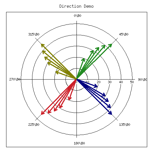
The class Chart::Direction creates a diagram based on polar coordinates. This type of diagram is occasionally referred to as a radial or as a radar chart, which has a circle as x-axis and its values define an angle. The y-value in the center is min_value and the most outer circle is at max_value. In order to reverse that you have to set polar 'true'. In our example we preferred to have a real comparison between arrow lengths so we artificially put zero as min_value by setting include_zero 'true'. The just mentioned arrow style we achieve by deactivating point (drawing small circles) and turning on arrow. An additional 'true' line would connect the points (arrow heads) with lines (as well as the first and last). As in \Lines and \Points: pt_size defines the point size and brush_size the line thickness. Usually the background of each chart (just inside the coordinate system) is a light gray - here deactivated. Radial grid lines are drawn every 45 degrees (angle_interval).
As with most chart types, the first data set defines the domain : the x-values of all following data sets, which then define the associated y-values (and therefore all sets have to have the same length). Because we set in this example pairs 'true', now every odd numbered data set is the domain for the next, but they still have to have the same length
use Chart::Direction;

my $g = Chart::Direction->new( 500, 500 );

$g->add_dataset( 210, 220, 200, 215, 225, 200 );
$g->add_dataset( 30,  40,  20,  35,  45,  20 );

$g->add_dataset( 30, 40, 20, 35, 45, 20 );
$g->add_dataset( 30, 40, 20, 35, 45, 20 );

$g->add_dataset( 120, 130, 110, 125, 135, 110 );
$g->add_dataset( 30,  40,  20,  35,  45,  20 );

$g->add_dataset( 300, 310, 290, 305, 315, 290 );
$g->add_dataset( 30,  40,  20,  35,  45,  20 );

$g->set(
    title           => 'Direction Demo',
    angle_interval  =>  45,
    precision       =>   0,
    arrow           => 'true',
    point           => 'false',
    include_zero    => 'true',
    legend          => 'none',
    grey_background => 'false',
    pairs           => 'true',
);
$g->png("direction.png");
ErrorBars
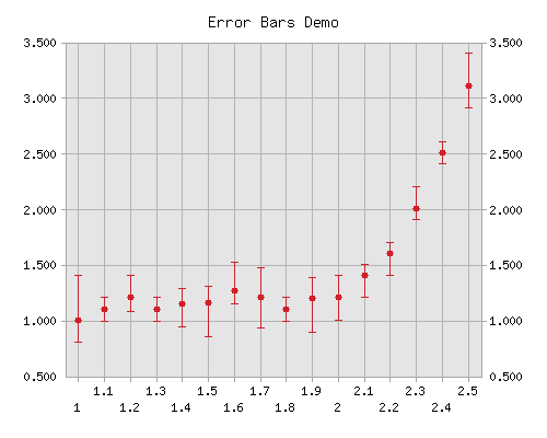
The class Chart::ErrorBars creates a point chart with error bars, which are vertical lines, depicting the uncertainty - a range which is possible for that value. As seen in the example, we need four data sets to define a series of error bars. The first data set are the x-values of the error bars, the second the y-values. The third set holds the lenght of the upper part of the error bar and the fourth set the lower part (distance between main point and the lower bound of the error bar). The fourth set might be omitted, when property same_error is set 'true'. In this case upper and lower part of the error bar have the same size. Because in all this produced only one set of error bars with one color, there is no need for a legend. That is why it is switched off by setting property legend to 'none'. The label on the x-axis are painted in the 'staggered' style, so they don't overlap. pt_size refers to the diameter in pixel of the errors bars central point. brush_size is the thickness of the bar. For better readability 'both' y_axes were labeled.
use Chart::ErrorBars;

my $g = Chart::ErrorBars->new();
$g->add_dataset(qw(1   1.1  1.2  1.3  1.4  1.5  1.6  1.7  1.8  1.9  2   2.1 2.2 2.3 2.4 2.5));
$g->add_dataset(qw(1   1.1  1.2  1.1  1.14 1.15 1.26 1.2 1.1  1.19 1.2 1.4 1.6 2.0 2.5 3.1));
$g->add_dataset(qw(0.4 0.1  0.2  0.1  0.14 0.15 0.26 0.27 0.1  0.19 0.2 0.1 0.1 0.2 0.1 0.3));
$g->add_dataset(qw(0.2 0.11 0.12 0.11 0.2  0.3  0.12 0.27 0.11 0.3  0.2 0.2 0.2 0.1 0.1 0.2));
$g->set(
    title          => 'Error Bars Demo',
    legend         => 'none',
    y_axes         => 'both',
    x_ticks        => 'staggered',
    pt_size        => 12,
    brush_size     => 2,
    grid_lines     => 'true',
    colors => {
        grid_lines   => 'gray70',
        misc         => 'gray65',
    },
);
$g->png("error.png");
HorizontalBars
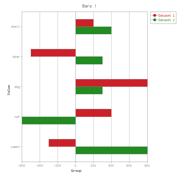
The class Chart::HorizontalBars creates a chart of horizontally oriented bars. Same rules apply as in "Bars", except due negative values in our data sets here min_val doesn't have to be set to zero. And instead of y_grid_lines we activate and color x_grid_lines
use Chart::HorizontalBars;

my $g = Chart::HorizontalBars->new( 600, 600 );
$g->add_dataset( qw/ camel cat dog bear shell/ );
$g->add_dataset( -300,  400, 800, -500, 200 );
$g->add_dataset(  800, -600, 300,  300, 400 );
$g->set(
    title         => 'Bars !',
    x_label       => 'Group',
    y_label       => 'Value',
    x_grid_lines  => 'true',
    precision     =>  0,
    colors => {
        x_grid_lines => 'gray70',
        misc         => 'gray55',
        text         => 'gray55',
        x_label      => 'gray40',
        y_label      => 'gray40',
        title        => 'gray20',
    }
);
$g->png("hbars.png");
Lines
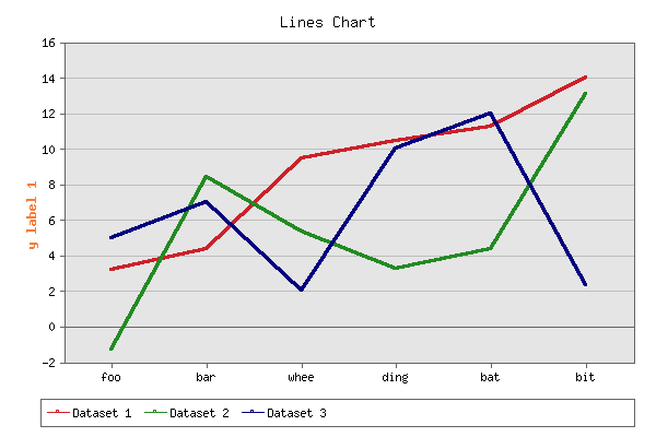
The class Chart::Lines creates a chart with lines that connect the would be data points. If you want to make the points more visible, use "LinesPoints". The only special property is brush_size, the thickness of the lines, which was not even utilized in this example. To make things nicer we put only some softer colors to the horizontal (y) grid lines and the box and ticks (misc) and placed the legend on the bottom so that the chart doesn't get sqeezed by it.
use Chart::Lines;

my $g = Chart::Lines->new( 600, 400 );
$g->add_dataset( 'foo', 'bar', 'whee', 'ding', 'bat',    'bit' );
$g->add_dataset(  3.2,  4.34, 9.456,  10.459, 11.24234, 14.0234 );
$g->add_dataset( -1.3,   8.4,  5.34,   3.234,     4.33, 13.09 );
$g->add_dataset(    5,     7,     2,      10,       12,  2.3445 );
$g->set(
    title        => 'Lines Chart',
    legend       => 'bottom' ,
    y_label      => 'y label 1',
    precision    =>  0,
    y_grid_lines => 'true',
    colors       => {
        y_label      => 'orangepeel',
        y_grid_lines => [ 190, 190, 190 ],
        misc         => [ 100, 100, 100 ],
    },
);
$g->png("lines.png");
LinesPoints
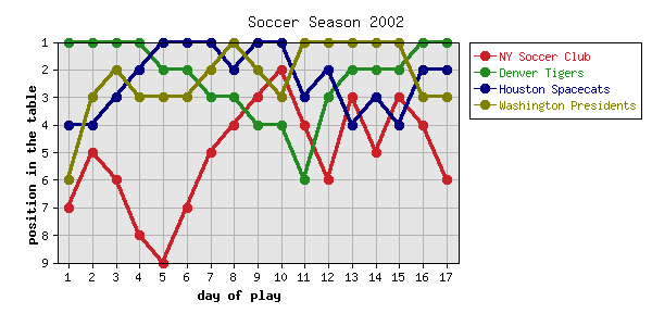
The class Chart::LinesPoints creates chart, which is a combination of "Points" and "Lines": shaped symbols connected by lines. This requires a combination of the special properties of both chart types: brushStyle (point shape), pt_size (point diameter) and brush_size (line thickness).
In our example we named both axis via x_label and y_label and set xy_plot off, which is not really needed, since it is on 'false' per default. This allows you to give the x-axis none numerical, custom tick labels, which are by accident the numbers 1 .. 18, as the first data row shows. The purpose of this maneuver is to not have zero as the first column label.
Because the origin of coordinate system is usually in the left lower corner, we used a trick to flip the y-axis having the smallest values up. We negated all values in the data, so that 8 is lower than 2, because -8 is smaller than -2. Than we transformed the y-axis labels with a function, that negates the value of the original label, erasing the minus sign.
For additional clarity, we put the names of the teams into the legend, which is per default on the right side. And to make the code more compact, we packed the first (just labels) and the four real data sets (rows) together into an array or arrays and gave it as second argument directly to the drawing method.
use Chart::LinesPoints;

my $g = Chart::LinesPoints->new( 600, 300 );
$g->set(
    'title'              => 'Soccer Season 2002',
    'legend_labels'      => ['NY Soccer Club', 'Denver Tigers',
                             'Houston Spacecats', 'Washington Presidents'],
    'y_label'            => 'position in the table',
    'x_label'            => 'day of play',
    'grid_lines'         => 'true',
    'f_y_tick'           =>  sub { - $_[0] },
    # 'xy_plot'          => 'false',
    'integer_ticks_only' => 'true',
);
$g->png("linespoints.png", [
    [qw(1 2 3 4 5 6 7 8 9 10 11 12 13 14 15 16 17)],
    [qw(-7 -5 -6 -8 -9 -7 -5 -4 -3 -2 -4 -6 -3 -5 -3 -4 -6)],
    [qw(-1 -1 -1 -1 -2 -2 -3 -3 -4 -4 -6 -3 -2 -2 -2 -1 -1)],
    [qw(-4 -4 -3 -2 -1 -1 -1 -2 -1 -1 -3 -2 -4 -3 -4 -2 -2)],
    [qw(-6 -3 -2 -3 -3 -3 -2 -1 -2 -3 -1 -1 -1 -1 -1 -3 -3)],
]);
Mountain
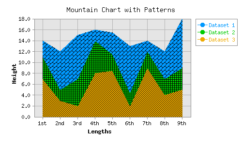
The class Chart::Mountain creates a mountain chart, which is a line chart (see "Lines"), where the area under the curve, right to the curve below is filled with the color of the data set. In the following example we use custom colors in hex notation (which Chart::Color supports) which getting mapped onto the colors settings of dataset0 .. dataset4. As always, the first (data set) row in the data are the domain or x-axis labels. Another specialty of mountain charts are patterns (not provided !), to fill the area with. We load them via GD and give them over to the 'patterns' property. Patterns are small images with one color and the second being transparent
use Chart::Mountain;

my @data = (
    ["1st", "2nd", "3rd", "4th", "5th", "6th", "7th", "8th", "9th" ],
    [ 3, 7, 8, 2, 4  , 8.5, 2, 5, 9],
    [ 4, 2, 5, 6, 3  , 2.5, 3, 3, 4],
    [ 7, 3, 2, 8, 8.5, 2  , 9, 4, 5],
);
my @hex_colors = ('#0099FF', '#00CC00', '#EEAA00', '#FF0099','#3333FF');
my $PNG;
my @patterns = map {
    open( $PNG, '<', "./patterns/PATTERN$_.PNG" ) or die "Can't load pattern $_";
    GD::Image->newFromPng( $PNG );
} 0 .. 4;

my $g = new Chart::Mountain( 500, 300);
$g->set(
    title      => 'Mountain Chart with Patterns',
    x_label    => 'Lengths',
    y_label    => 'Height',
    grid_lines => 'true',
    patterns   => \@patterns,
    precision  => 1,
    colors => {
            grid_lines => 'gray70',
            misc       => 'gray55',
            map { ( "dataset$_" => $hex_colors[$_] ) } 0 .. $#hex_colors,
    },
);
$g->png( 'mountain.png', \@data );
Pareto
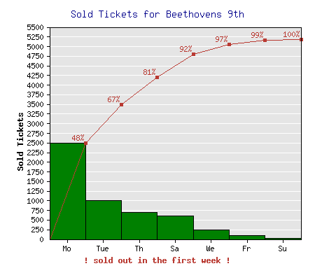
The class Chart::Pareto creates a combination of a "Bars" and a "Lines" chart. The bars display absolute values of the data set (Pareto accepts only one), while the line represent the accumulation (sum of all values from the start on the left up to this value). For a better orientation the absolute values should be sorted. In case your data set is not already, change the property <sort|Chart::Manual::Properties/sort> to 'true'. (Note that the days of the week are not in chronological order, but in the order of decreasing sale amounts.) The first given data set is like in most cases the domain (x-axis labels). So the color of the first data set containing numbers has the color of dataset0 and the accumulation gets the color of dataset1 (which are per default also red and green, but in reverse order).
For better optics we set spaced_bars off, so that the bars touch each other and give a nice counterweight to the red color of the line. It's also a bit nicer, when the red labels above the red line don't stick out the chart, so we increased the max_val from 5180 to 5500. Finally to prevent the y-axis from overcrowding we set labels (and y_grid_lines) only every 250 by setting skip_int_ticks and activating integer_ticks_only.
use Chart::Pareto;

my $g = Chart::Pareto->new( 450, 400 );
$g->add_dataset( 'Mo', 'Tue', 'We', 'Th', 'Fr', 'Sa', 'Su' );
$g->add_dataset( 2500, 1000,  250,  700,  100,  610,  20 );
$g->set(
    title              => 'Sold Tickets for Beethovens 9th',
    y_label            => 'Sold Tickets',
    x_label            => '! sold out in the first week !',
    sort               => 'true',
    max_val            => 5500,
    integer_ticks_only => 'true',
    skip_int_ticks     => 250,
    y_grid_lines       => 'true',
    spaced_bars        => 'false',
    legend             => 'none',
    colors  => {
        title        => 'darkblue',
        dataset0     => 'green',
        dataset1     => 'red',
        x_label      => 'red',
        y_grid_lines => 'white',
    },
);
$g->png("pareto.png");
Pie
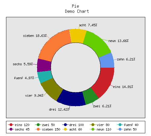
The class Chart::Pie creates a pie or ring chart. The first added data set must contain the labels and the second set the values. Our example displays a ring chart with a thickness of 35% (of the radius). If the ring property is omitted, the chart falls back to regular pie. Every ring slice is labeled with the stated label, plus the percentage of its value, as defined with the property label_values. Connecting lines between label and slice are drawn because legend_lines is set to 'true'. The actual legend is placed on the bottom, in order to leave the ring as large as possible. The legend again shows the association between color and data point and its value because legend_label_values is set to 'values'. Unlike other chart types, where one data set is correlated with a color, here every slice has to have its own color. Thats why the first data point has the color of dataset0 the second of dataset1 and so forth. In most case the default colors are good enough unless you want special meanings in mind. Please also note the multi line (row) title.
use Chart::Pie;

my $g = Chart::Pie->new( 500, 450 );
$g->add_dataset( qw/eins zwei drei vier fuenf sechs sieben acht neun zehn/ );
$g->add_dataset( 120, 50, 100, 80, 40, 45, 150, 60, 110, 50 );
$g->set( 'title'               => 'Pie\nDemo Chart',
         'legend'              => 'bottom',
         'legend_label_values' => 'value',
         'label_values'        => 'percent',
         'legend_lines'        => 'true',
         'ring'                => 0.35,
);

$g->png("pie.png");
Points
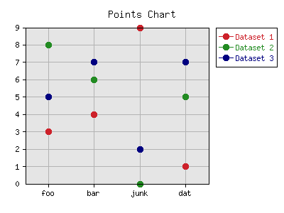
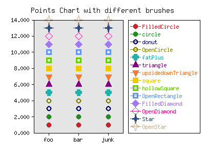
The class Chart::Points creates a xy-chart (also called scattergram), where the individual data points are marked with a symbol. The shape of the symbol is selected by the property brushStyle, which was not utilized in this example, in order to use the default shape: a circle of a diameter set by pt_size. All shapes can be seen in the demo above. (If you want in addition lines, connecting the points, check "LinesPoints".)
The first data set comprises the domain set, displayed on the x-axis. precision set to zero cuts the decimals on the y-axis labels and keeps it clean. The method add_pt appends to every data set another value, adding another column to the chart. png_border does just adds frame of 10 pixel width around the entire image.
use Chart::Points;

my $g = Chart::Points->new();
$g->add_dataset( 'foo', 'bar', 'blank' );
$g->add_dataset(  3,  4,  9 );
$g->add_dataset(  8,  6,  0 );
$g->add_dataset(  5,  7,  2 );
$g->add_pt( 'dat', 1, 5,  7 );
$g->set(
    title        => 'Points Chart',
    pt_size      => 18,
  # brushStyle   => 'Star',
    precision    =>  0,
    grid_lines   => 'true',
    png_border   => 10,
);
$g->png("points.png");
Split
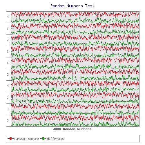
The class Chart::Split creates a "Lines" chart where both x and y axes are assumed to be numeric. Split charts are mainly intended for cases where many data points are spread over a wide x range while at the same time the y range is limited. Typical examples are weather or seismic data. The x axis will be split into several intervals of the same length (specified with the mandatory option interval and starting at start). Chart::Split will draw only positive x coordinates. The y axis will not be labelled with the y values. Rather, the axis will show only the sequence numbers of the intervals.
use Chart::Split;

my $g = Chart::Split->new( 500, 500 );

my @domain = 1 .. 4000;
my @rnd    = map { srand( time() / $_ * 50 ); rand(10) } @domain, 4001;
my @diff   = map { abs $rnd[$_-1] - $rnd[$_] } @domain;
pop @rnd;

$g->add_dataset(@domain);
$g->add_dataset(@rnd);
$g->add_dataset(@diff);
$g->set(
    title          => "Random Numbers Test",
    x_label        => "4000 Random Numbers",
    start          => 0,
    interval       => 400,
    brush_size     => 1,
    interval_ticks => 0,
    legend         => 'bottom',
    legend_labels  => ['random numbers', 'difference' ],
    colors => {
           title => 'darkblue',
           text  => 'gray45',
           misc  => 'gray45',
    },
);
$g->png("split.png");
StackedBars
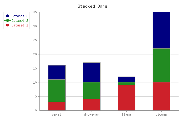
The class Chart::StackedBars creates a chart made up of stacked vertical bars instead of being beside each other. This means the bars depicting data set 3 are on top of data set 2 and data set 4 is the highest. Except this change, same rules again apply as in "Bars".
use Chart::StackedBars;

my $g = Chart::StackedBars->new( 600, 400 );
$g->add_dataset( 'camel', 'dromedar', 'llama', 'vicuna');
$g->add_dataset( 3, 4,  9,  10,  );
$g->add_dataset( 8, 6,  1,  12,  );
$g->add_dataset( 5, 7,  2,  13,  );
$g->set(
    title             => 'Stacked Bars',
    legend            => 'left',
    precision         =>  0,
    grey_background   => 'false',
        colors => {
         x_grid_lines => 'gray70',
         misc         => 'gray55',
         text         => 'gray55',
         x_label      => 'gray40',
         y_label      => 'gray40',
         title        => 'gray20',
     }
);
$g->png("stackedbars.png");
COPYRIGHT & LICENSE
Copyright 2022 David Bonner, Herbert Breunung.
This program is free software; you can redistribute it and/or modify it under same terms as Perl itself.
AUTHOR
David Bonner, <chartgrp@web.de>
Herbert Breunung, <lichtkind@cpan.org>